Intro To Graphic Design For Churches
Intro To Graphic Design For Churches
Welcome to the wonderful world of graphics!
This course is your starting point for making great designs.
We’ll be covering how to design for online as well as print.
Here at New Creation Network we use the Adobe Creative Cloud. It’s a bunch of apps that allow us to create on purpose for a purpose which is ultimately
building people.
The first course we’ll be covering is Photoshop.
Think of Photoshop as a “digital collage”. This application uses layers, masks, and effects to create design for a variety of applications.
Photoshop is great for online/social content as well as certain print applications. This application will help cover some basic terms:
Size
How big does our digital canvas need to be? That depends on your application. If you’re looking to design online you’ll be using pixels as your measurement. If you’re doing design for print you’ll be working with inches or centimeters.
Some sizes to be familiar with:
- A “social square” is 1080x1080 pixels wide.
- A typical youtube video will be 1920x1080 pixels wide
- A regular piece of paper is 8.5x11in
Resolution
Now that we have our size let’s talk about another aspect of our image resolution. You might hear pixel density, or pixels per inch, but it’s all the same thing. Pixels are tiny, tiny, dots that make up an image. The more pixels you have in your image the clearer it will be and the easier it will be to scale.
Photoshop’s default is set to 72 which is fine for online content, but more often than not you’ll want your design to look great across multiple forms of media.
“It looked fine on my computer screen, but when I print it out it’s blurry! Help!”. We’ve heard that many times. You need to remake your project with more pixels per inch. Your file size will be bigger, but it will look clear.
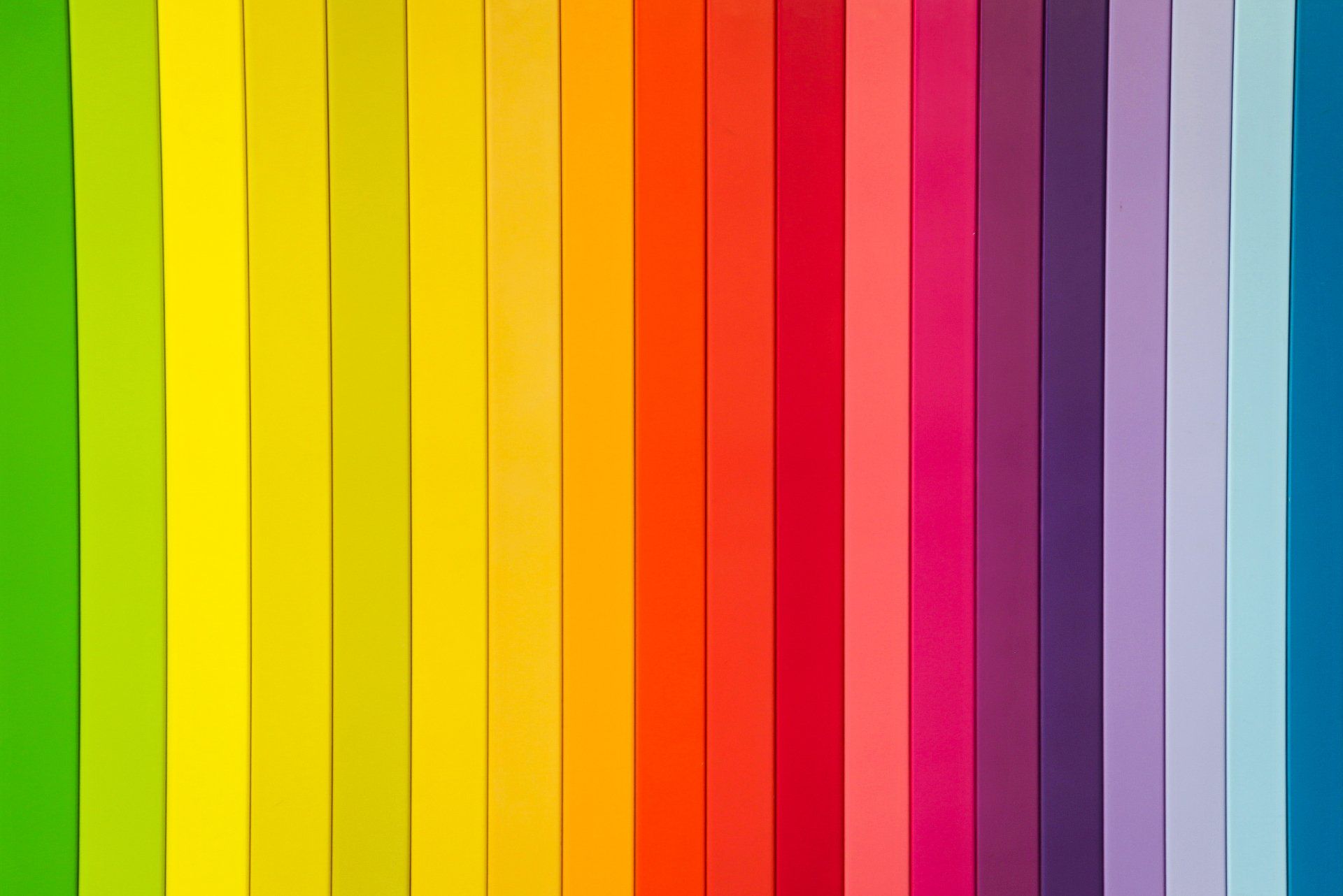
Color
What’s your favorite color? Is the dress blue or gold? When we talk about setting up your project we’re really referring to the color space. There are two colorspaces we’ll focus on:
RGB & CMYK
RGB stands for red, green, and blue. If you're making a design for online or social media you will use this color space.
CMYK stands for cyan, magenta, yellow, and black (“K” is black just roll with it). Anything you do for print will be CMYK.
“But what if I make my graphic in RGB for social purposes, but later decide I want to print it?”
Your graphic will still print, and truthfully, you might not even notice the difference… HOWEVER: when it comes to critical color you will want to be aware of this.
“Bit depth” refers to how wide your colorspace is. For all intensive purposes you can leave this set to the default.
With that we can create our first project! We hope you learned something! Go through this article as many times as necessary as you begin to familiarize yourself with these terms. We can’t wait to see your first design!